Recently updated on August 15th, 2024
How can you improve your current training website to make it more accessible? It’s a question many training providers are asking. An accessible website allows learners of all abilities to easily navigate and fully engage with the resources it offers, while expanding the potential participant base for training providers.
In this blog post, we share ten beginner tips you can implement to start making your existing website more accessible. We also cover some frequently asked questions about website accessibility, providing the key information you need to know.
What is web accessibility?
According to the World Wide Web Consortium, an international public-interest nonprofit organization that works to develop web standards, web accessibility means that websites, tools, and technologies are designed and developed so that people with disabilities can use them.
More specifically, people can:
- Perceive, understand, navigate, and interact with the web
- Contribute to the web
Web accessibility encompasses all disabilities that affect access to the web, including:
- Auditory
- Cognitive
- Neurological
- Physical
- Speech
- Visual
The current Web Content Accessibility Guidelines (WCAG) are available in version 2.2, with version 3.0 currently under development.
Why is web accessibility important?
Web accessibility is important because it ensures that all individuals, regardless of their physical or cognitive abilities, have equal access to information and functionalities on a website. Approximately 16% of the world’s population has a disability (one in six of us), so when a website is not accessible, it effectively excludes a large portion of the population from using it. Web accessibility is about creating a more inclusive web experience for everyone.
Read related article: SEO for training companies: 12 tips to get more traffic in 2024
Tips on making your training website more accessible
Making a training website more accessible can range from simple tweaks to significant redesigns. If you’re just getting started, it’s important to assess specific web pages of your existing site before implementing any changes.
Here are some easy tips to implement:
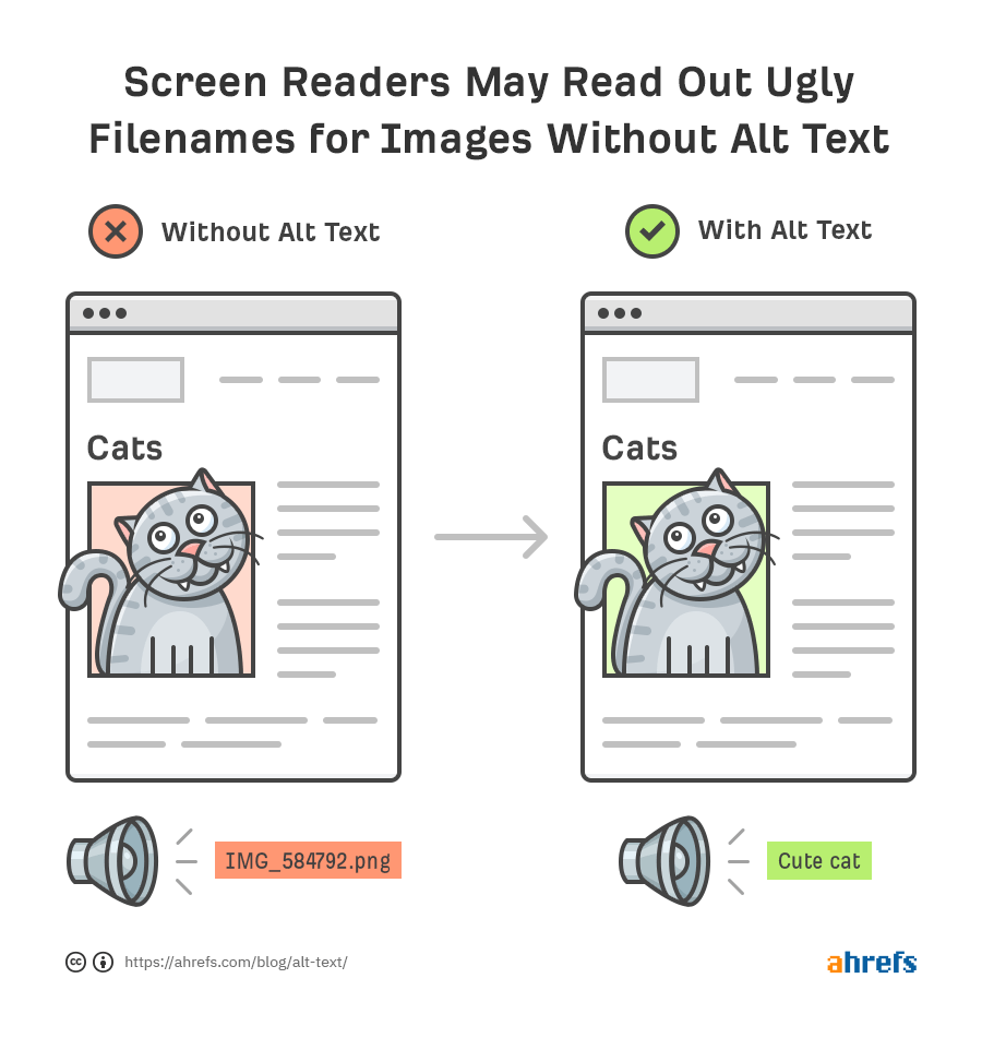
1. Provide clear ALT text for all images you use
You should provide descriptive alternative text for images to help screen reader users and users with visual impairments understand the content of the image. This is important because assistive technologies such as screen readers can read out the alt text, allowing blind and low-vision users to understand the content of the images on your website.
For example, instead of using “image1.jpg” as the alt text, use a descriptive phrase like “Photo of a sunset over the ocean” to provide context for users who cannot see the image. The image below from Ahrefs highlights the point perfectly:
2. Ensure sufficient color contrast
Make sure your website contains sufficient color contrast between text and background. This helps users with visual impairments read your content more easily and distinguish between text and background.
Some ways you can do this include:
Adopt high contrast ratios – ensure that text and background colors have a contrast ratio of at least 4.5:1 for normal text and 3:1 for large text. Tools like the WebAIM Color Contrast Checker can help verify these ratios.
Avoid problematic color combinations – stay away from combinations like green/red or blue/purple, which can be challenging for those with color blindness. Choose colors that differ in brightness and saturation so they are easily legible.
3. Use descriptive link text
Ensure that the links on your website have descriptive text so that users with visual impairments know where they are heading. This helps screen readers communicate the purpose of the link, allowing blind and low-vision users to navigate your site with ease.
Avoid using vague link texts such as “Click here”; instead, provide more specific descriptions like “Check out our Contact Page.” Similarly, rather than saying “See details,” use something more informative like “View the full schedule of our upcoming webinars,” which clearly communicates the link’s destination and purpose.
The University of Auckland Business School does a great job of using descriptive link text on their website:

4. Use a logical heading structure
A logical heading structure (H1-H6) helps users with visual impairments understand the content’s hierarchy. A clear structure assists screen readers and other assistive technologies in providing a clear outline of the content, allowing users to navigate and understand the content of a web page more effectively.
Here’s a sample layout of a web page to help you visualize what a logical heading structure looks like:
- H1: Main Title of the Webpage
- H2: Introduction
- H3: Purpose of the Page
- H2: Main Content
- H3: Key Topic 1
- H3: Key Topic 2
- H2: Detailed Analysis (Optional)
- H3: Detailed Discussion of Key Topic 1
- H3: Detailed Discussion of Key Topic 2
- H2: Conclusion
- H3: Summary and Key Takeaways
- H2: Additional Resources or References
- H2: Introduction
5. Provide closed captions for audio and video
Closed captions help users with hearing impairments understand audio and video content. You can provide these captions by uploading a caption file, using automatic captioning tools, or hiring a third-party service to create and synchronize captions with your training materials.
6. Use clear form labels
Use clear and descriptive labels for form fields to help users with visual impairments understand what information to enter.
Bad Example:
- Form Field: _______
- Label: “Enter name”
Problem: The label is too vague and doesn’t specify what exact information is needed.
Good Example:
- Form Field: _______
- Label: “First and Last Name (e.g., John Smith)”
Benefit: This label clearly specifies that both first and last names are required, and provides an example for clarity.
7. Utilize clear table structures
When you’re laying out information in a table format on your website, make sure it has a clear, defined structure. A clear table structure helps screen readers and assistive technologies provide a clear understanding of the table’s content, allowing users with visual impairments to navigate and understand the data.
You can achieve this by using clear and descriptive headings for each column, ensuring each row has the same number of columns, avoiding merged cells in complex layouts, and arranging the information in the table in a logical order.
Here’s an example table:
| Course | Duration | Topics Covered | Level | Price |
| Introduction to Marketing | 4 weeks | Marketing fundamentals, target audience, campaign planning | Beginner | $299 |
| Digital Marketing Advanced | 8 weeks | Search engine optimization, social media marketing, analytics | Intermediate | $499 |
| Leadership Skills | 6 weeks | Communication, team management, strategic planning | Advanced | $399 |

Websites built for training
Want to learn about training provider websites?
Get the Ultimate Guide to Websites for Training Providers.
8. Make sure your website is keyboard accessible
Keyboard accessibility is important for users with mobility impairments who may find using a mouse difficult or impossible. For a website to be easily navigable by all users, all interactive elements on the website should be accessible through keyboard shortcuts and tab navigation. This includes form fields, buttons, links, and other controls.
9. Use responsive design
Your website’s design should be responsive to accommodate users with visual impairments. Your site should automatically adjust its layout to suit different screen sizes and orientations. A responsive design allows users to navigate and read your site with ease, regardless of the device they are using.
For instance, text should reflow on mobile devices to avoid horizontal scrolling, and interactive elements like buttons and form fields should be easily clickable without relying on a mouse.
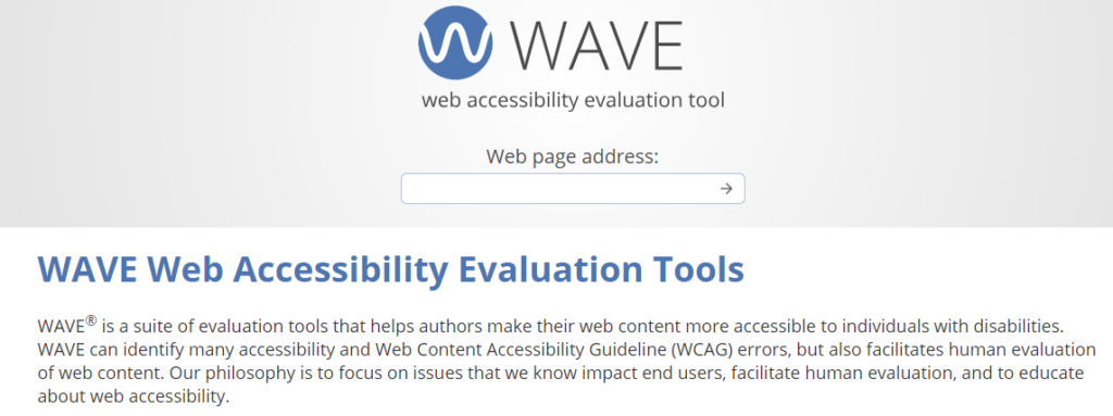
10. Test for accessibility
There are several effective methods to evaluate your website’s accessibility. One practical approach is to use an accessibility evaluation tool. These tools provide immediate insights and accessibility recommendations.
One tool to consider is WAVE:
WAVE
WAVE (Web Accessibility Evaluation Tool) is a suite of evaluation tools that helps site owners make their web content more accessible. It’s very simple to get started: all you need to do is paste your website URL into the ‘Web page address’ field, press the arrow, and WAVE will highlight areas of your site that don’t meet WCAG standards.
You can also use the service to obtain an Accessibility Impact (AIM) report that provides detailed WAVE data, your site’s AIM score, and expert manual test results that offer tips on how you can make it more accessible.
Key resources to check out
Web accessibility is a broad topic. Although we’ve covered some beginner tips in this article, it’s worth familiarizing yourself with the guidelines themselves and other useful resources for a more comprehensive understanding:
- The full web accessibility guidelines by The World Wide Web Consortium
- Evaluating web accessibility overview by The World Wide Web Consortium
- The ultimate guide to website accessibility by HubSpot
- 13 modern accessible website examples to inspire you by Accessibility Checker
Frequently asked questions about website accessibility
There are four key principles that guide the WCAG guidelines:
Perceivable – users must be able to perceive the information being presented (it cannot be invisible to all of their senses). The specific WCAG guidelines around this principle are:
– Provide text alternatives for non-text content.
– Provide captions and other alternatives for multimedia.
– Create content that can be presented in different ways, including by assistive technologies, without losing meaning.
– Make it easier for users to see and hear content.
Operable – users must be able to operate the interface (the interface cannot require interaction that a user cannot perform). The specific WCAG guidelines around this principle are:
– Make all functionality available from a keyboard.
– Give users enough time to read and use content.
– Do not use content that causes seizures or physical reactions.
– Help users navigate and find content.
– Make it easier to use inputs other than the keyboard.
Understandable – users must be able to understand the information as well as the operation of the user interface (the content or operation cannot be beyond their understanding). The specific WCAG guidelines around this principle are:
– Make text readable and understandable.
– Make content appear and operate in predictable ways.
– Help users avoid and correct mistakes.
Robust – users must be able to access the content as technologies advance (as technologies and user agents evolve, the content should remain accessible). The specific WCAG guidelines around this principle are:
– Maximize compatibility with current and future user tools.
Alongside the four principles guiding the WCAG guidelines, there are also levels that assess adherence to them, which are A, AA, and AAA. Each level includes guidelines that must be met to consider a website accessible to all users.
The distinction between criteria levels provides organizations with an organized structure for minimal, acceptable, and optimal accessibility. They also offer more flexibility, so even very complex websites can maintain a minimum criteria level.
Here’s a breakdown of the grades:
Level A: Minimal compliance
Level A criteria represent the most basic level of web accessibility. At this level, websites must meet basic accessibility criteria, ensuring that:
– The website provide accessible web content that is available and accessible to users with disabilities..
– Keyboard navigation is possible for users who cannot use a mouse.
– Clear and consistent navigation and content structure are provided.
– Assistive technologies can interact with interactive elements.
Level AA: Acceptable compliance
Level AA criteria are used in most accessibility rules and regulations around the world. To meet this criteria, the website must be usable and understandable for the majority of people, with or without disabilities, ensuring that:
– Color contrast is, in most instances, at least 4.5:1, making text readable for users with visual impairments.
– Alt text or similar solutions are used for images that convey meaning, providing equivalent information for users with visual impairments.
– Navigation elements are consistent throughout the site, enabling users to easily find what they need.
– Form fields have accurate labels, allowing users to understand the purpose of each field.
– Status updates can be conveyed through a screen reader, keeping users informed of changes.
– Headings are used in logical order, organizing content in a clear and understandable structure.
Level AAA: Optimal compliance
Level AAA criteria make your site accessible to the maximum number of users and ensure this experience is easy. While this level of criteria would ideally make the web experience truly equal for all users, the Web Accessibility Initiative explains in their compliance documentation “it’s not recommended that Level AAA criteria be required as a general policy for entire sites because it is not possible to satisfy all Level AAA success criteria for some content.”
Some features that could give a website an AAA grading include:
– Sign language interpretation is provided for audio or video content, enabling users who are deaf or hard of hearing to understand the content.
– Color contrast is at least 7:1 in most instances, making text highly readable for users with visual impairments.
– Timing is not an essential part of any activity, allowing users with disabilities to complete tasks without time constraints.
– Context-sensitive help is available, providing users with additional support and guidance when needed.
Ideally, you should aim for your website to reach the AA level, which is the accepted compliance level. As mentioned above, this level is most commonly used in rules and regulations because the required changes to bring a website up to this grading are within reach of many website owners.
The legal status of web accessibility guidelines varies by jurisdiction. If you need to align your website with accessibility legislation in the areas where your business operates, we recommend consulting a web accessibility professional or consultant to ensure compliance.
Leave it to the experts
Book a FREE consultation today with the Arlo Professional Services team to discuss how we can help make your website WCAG compliant.